Use advanced CSS to style Klaviyo Reviews widgets
Elevate the appearance of your Klaviyo reviews widgets with advanced CSS customization.
Overview
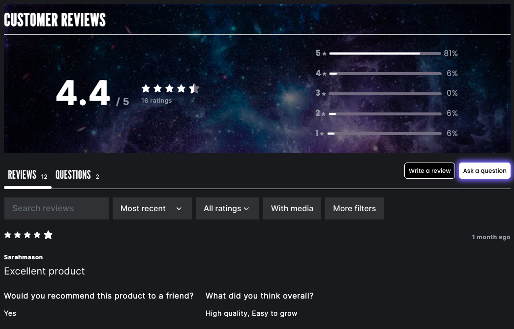
This guide will show you how to use Klaviyo's CSS classes to create a fully customized Product Reviews widget. In the provided example, you will learn the CSS needed to create one specific design, but you can use your own CSS to customize every element of the widget. This guide applies custom styling to Klaviyo’s Product Reviews widget with glow effects, images, and more.
Before you begin
- Make sure you’re familiar with our reviews widgets.
- Learn about basic use cases for customizing your reviews widgets.
- Check out our Klaviyo Reviews CSS class reference.
Note that Klaviyo Reviews CSS, including default styles, loads after Shopify’s CSS. It’s important to use precise selectors so that your CSS isn’t overwritten by default styles.
Getting started with custom CSS
For Shopify users:
- In your Shopify admin, navigate to Online Store > Themes.
- From the additional options menu (3 dots) for your current theme, click Duplicate.
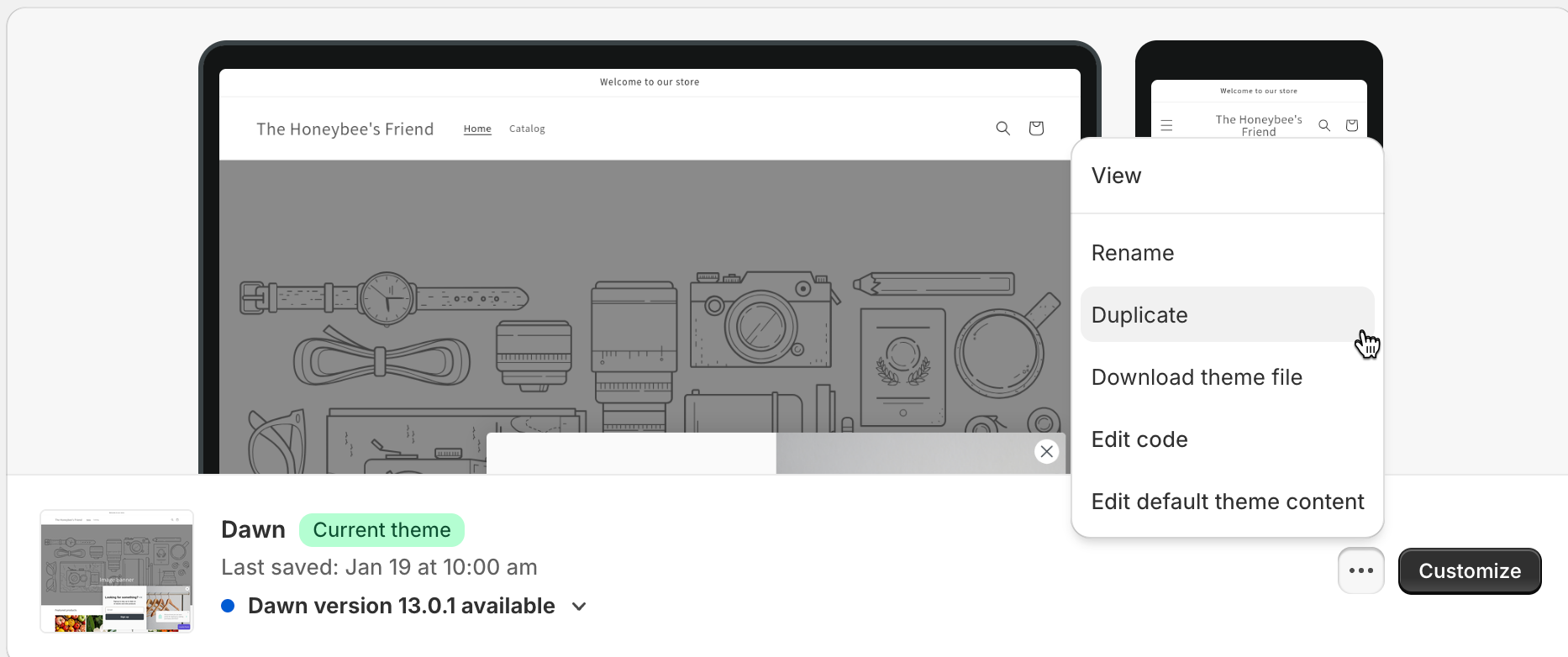
- From the additional options menu for your copied theme, click Edit Code.
- From the Assets folder, click Add a new asset. Create a blank file and name it
reviews.css. - In your
theme.liquidfile, under{{ base.css' | asset_url | stylesheet_tag }}, add{{ 'reviews.css' | asset_url | stylesheet_tag }}. - Optional: This guide uses the following code snippet from Google Fonts. If you would like to use these fonts, add the snippet before the closing
</head>tag in yourtheme.liquidfile:
<link rel="preconnect" href="https://fonts.googleapis.com">
<link rel="preconnect" href="https://fonts.gstatic.com" crossorigin>
<link href="https://fonts.googleapis.com/css2?family=Inter:[email protected]&family=League+Gothic&display=swap" rel="stylesheet">
For WooCommerce users:
You must use a page selector,
.page-id-YOUR_PAGE_ID, to apply CSS to a specific page or pages. Learn how to find a page ID.
- In your Wordpress admin, navigate to Appearance > Editor.
- Select Styles.
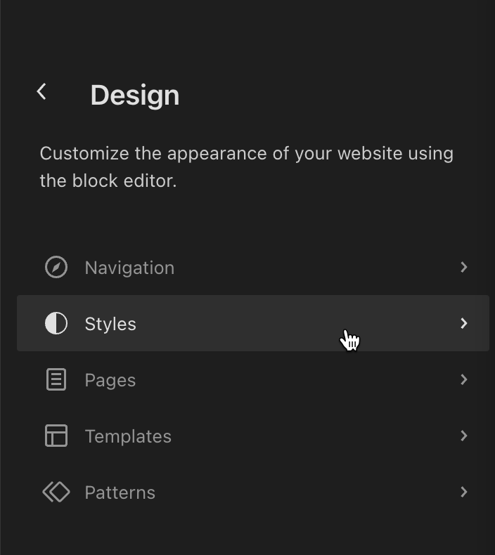
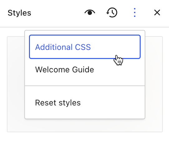
- Open the three dots (More) menu.
- Select Additional CSS.
Add custom CSS
To add custom CSS to the product reviews widget, you’ll need to use #klaviyo-product-reviews-wrapper. It’s important to use this wrapper, in addition to the widget’s available selectors, to ensure that your CSS overrides any default styling.
Customization variables
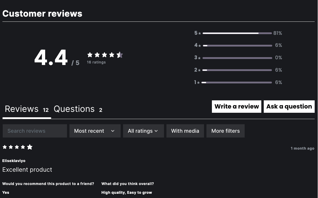
Add the following code snippet to your reviews.css file to apply a dark theme to your product reviews widget:
#klaviyo-product-reviews-wrapper {
  --kl-reviews-reviews-primary-background-color: #191a1e;
  --kl-reviews-reviews-primary-font-color: #ffffff;
  --kl-reviews-reviews-star-color: #ffffff;
  --kl-reviews-reviews-empty-star-color: #726b7f;
  --kl-reviews-reviews-accent-color: #ffffff;
  --kl-reviews-reviews-button-color: #ffffff;
  --kl-reviews-reviews-button-font-color: #000000;
  --kl-reviews-reviews-primary-font-font-family: "Inter";
}
Your widget should look something like this:
Product Reviews Summary styling
Header
Add the following code snippet to style the product reviews summary header:
  .kl_reviews__summary__header {
    font-size: 36px;
    text-transform: uppercase;
    font-family: "League Gothic", sans-serif;
  	margin-top: 0px;
    padding-top: 10px;
}
Review average
Add the following code snippet to style the average rating as it appears in the product reviews summary:
  .kl_reviews__summary__average {
    font-family: "Inter", "Assistant", sans-serif;
  }

  .kl_reviews__summary__average_value {
    font-size: 48px;
    font-style: normal;
    font-weight: 700;
    line-height: normal;
    letter-spacing: -2px;
  }
Review buttons
Use the following code snippet to style the Write a review and Ask a question buttons:
  .kl_reviews__button {
    border-radius: 0px;
    font-size: 12px;
    font-style: normal;
    font-weight: 500;
    line-height: 130.023%;
  }

  .kl_reviews__button:nth-child(1) {
    background-color: black;
    color: white;
    border-radius: 0px;
  }

  .kl_reviews__button:nth-child(2) {
    box-shadow: 0px 0px 10px 5px #7665ff;
    border-radius: 0px;
  }
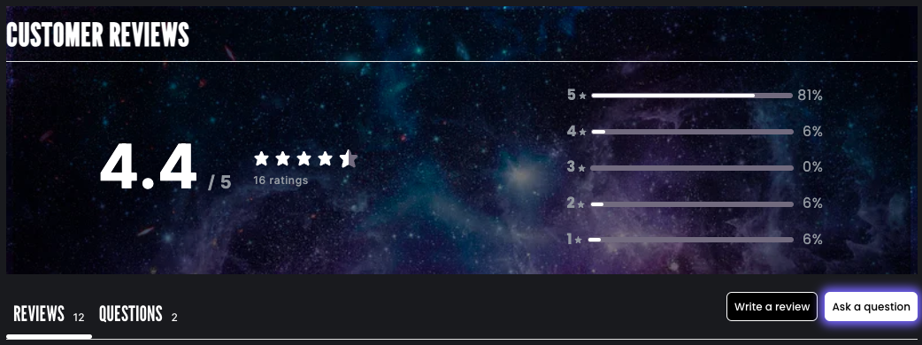
Background image
The best way to ensure that your image assets are secure is to host them on Shopify. Follow the steps below to upload your image to Shopify for use:
- In your Shopify admin, navigate to Content > Files.
- Click Upload files to upload an image. This will be used as your background image of the product reviews summary.
- Click on the Copy Link icon to copy the image URL.
- Add the following code snippet to your
reviews.cssfile. Paste your image URL.
  .kl_reviews__summary {
    background-image: url('https://cdn.shopify.com/s/files/1/0284/3128/6351/files/galaxy_background.png?v=1707862620');
    background-size: cover;
  }
Here’s how the image will appear on your product reviews widget:
Product Reviews List styling
List tabs
To style the list tabs (Reviews and Questions) and their corresponding counts, add the following code:
.kl_reviews__list__tab {
    font-size: 24px;
    text-transform: uppercase;
    font-family: "League Gothic", sans-serif;
  }

.kl_reviews__list__tabs button.kl_reviews__list__tab small {
    font-size: 12px;
    font-style: normal;
    font-weight: 500;
    line-height: 0%;
}

.kl_reviews__reviews_list.kl_reviews__reviews_list.kl_reviews__reviews_list .kl_reviews__list__tabs button.kl_reviews__list__tab:focus {
    outline: none;
}
Review filters
Add the code below to style the reviews filter selectors (Most recent and All ratings) and buttons (With media and More filters):
  .kl_reviews__reviews_list .kl_reviews__filters__pill select {
    font-size: 16px;
  }

  .kl_reviews__reviews_list .kl_reviews__filters__pill button {
    font-size: 16px;
  }
Custom question and answer text
Add the code below to style custom questions and answers in your reviews list:
  .kl_reviews__custom_question_answer {
    font-size: 14px;
    font-weight: normal;
  }

  .kl_reviews__custom_question_answer strong {
    font-size: 16px;
    font-weight: normal;
  }
Outcome
Your product reviews widget should look something like this:

Check out our Klaviyo Reviews CSS class reference for more information on available CSS classes to further style your Klaviyo Reviews widgets.
Updated over 1 year ago